What is the importance of typesetting?
Hey, there! I hope you’re all set to learn about typesetting today (see what I did there?)
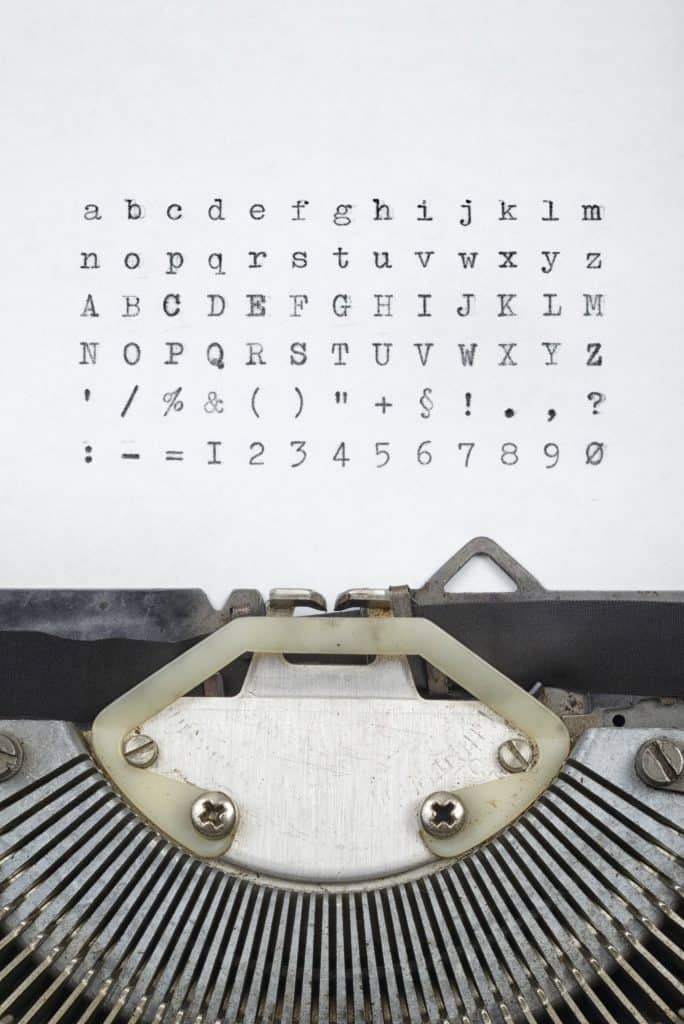
Before we learn of its importance, let me educate you on what exactly typesetting is. It’s the composition of text using individual types, which can range from symbols to letters and glyphs. This is an art that requires an understanding of fonts, font sizes, spacing, etc.
Typesetting is important as an attractive font will rake in views and leave your potential audience in awe at your work, while bad typesetting will only divert their attention. As you’ll learn further, the use of various fonts can even evoke a certain mood, time period, and even setting. For example, you could use a serif font to create a classic, traditional and stylish atmosphere or go for a more modern and simplistic look via the use of sans serif.
History of typesetting
This art dates back to even before the invention of the printing press by Gutenberg. Back in 1040 AD in China, ceramic movable types were used for printing. However, it has undergone an evolution, and now most typesetters and book designers prefer vector design software.

Classification of fonts
Before we learn the intricacies of typesetting, let’s go meet some of the members of the font family.
Serif
This font consists of letters with an extra stroke to them. The opposite of this is sans serif which lacks the stroke and features a more prominent cut.
Old style/Garalde
This font was used by Renaissance printers and consists of Roman elements. It features contrasting thick and thin strokes, rounded serifs and provides excellent readability.
Transitional
Transitional: These fonts are an amalgamation of both the old style and modern fonts and are characterized by majuscules and ascenders on the same line, oblique and horizontal breaks, as well as a slightly oblique horizontal axis. It too features a rounded serif, but unlike Old style is more formal, yet less formal than the modern fonts. A classic example of the same is Times New Roman.
Modern/Didone
This font boasts of some strong features such as contrasting thin horizontal strokes, thick vertical strokes, and unlike its peers, it prefers non-rounded serifs that are joined vertically. It is more commonly classified as an eighteenth-century font.
Slab serif:
This font comprises square and large serifs which are perpendicular with rectangular ends. Hence the name ‘slab serif’, obviously.
Gothic
These elaborate and complicated-shaped letters grace diplomas and other such formal invitations. However, this font is only legible in lowercase.
Handwritten:
Thanks to their highly rounded, cursive features, these fonts hardly offer any readability but are high on authenticity as they add a more natural look or touch to written material.
Decorative/novelty
Like handwritten fonts, these two lend originality to any written content.
Dingbats/ornamental
Fonts that are unique as the alphanumeric characters are ditched and replaced with symbols instead. While they serve no purpose unless you’re a gen Z/millennial with lackluster grammar skills, they still look visually appealing. But readability be damned, of course!

Structure of letters
Knowing how, when, where, and even why letters are placed in typesetting is important and makes the end result that much more rewarding and appealing to both you as a designer and to the reader. Here are some basic terms to keep in mind when it comes to structuring your letters:
Baseline
This is the imaginary line on which all your letters sit comfortably.
Capital height
This refers to the imaginary line that determines the top edge of your capital letters or uppercase.
Mean line
This horizontal line will determine the top extremities of your lower case letters.
Descender
It determines all the letters that sit below your baseline.
Ascenders
As the term suggests, this is the opposite of a descender and determines the top of the lowercase.

Learn the difference between Leading, kerning, and tracking
Typesetting comprises the following three tools which will lend beauty to the font you chose. Keep these in mind, and you’re all set!
Leading
This is a term for spacing of text in vertical lines and adjusting the spacing from bottom of words to top to ensure legibility. Each line of text is measured from the baseline.
Kerning
Basically, this means adjusting the distance between two letters, kind of like the strict chaperones at prom who ensure that there’s enough space between dancing couples who intend to do the hanky panky midway (if ya know what I mean). If the letters are way too close, then you’ve gone too far, and the block of text is indecipherable. Too far apart, and you’ve made the situation awkward. In order to ensure proper spacing, one needs to be up to date with all the stylistic flourishes of a particular font, and kerning not only requires a keen eye but also precision and loads of practice.
Tracking
A term used to indicate filling in a large or small space to suit the parameters of a type. Tracking makes a single word appear airy, appealing, and impressive.

Kerning tips
Here are some additional kerning tips and tricks:
- Before you begin to kern, make sure you’ve finished leading and tracking since otherwise, it will throw your text off balance.
- Try to kern manually if possible. While software offers automatic adjusting options, manual kerning will not only give you more control over your work but also help in differentiating spatial relationships between each typeface.
- One common kerning trick is visualizing sand between the spaces and making sure that the volumes are equal.
- Whatever you do, don’t zoom in too much as this will make the space appear larger than it is, i.e, create perceived space rather than the actual real final result which you intend to achieve.
- Kern your type upside down and in groups of three. Begin with the first three letters while covering up the others, before you move on to the rest.
- Less is more. Do not go overboard with your kerning. This will lead to tight spaces.
- Use different kerning for both logotypes and headlines. Mostly, headlines require larger types, whereas logotypes require a smaller and looser type.
- Gauge proper kerning. You can do this by seeing the distance between two straight letters (I,I) as a single unit, straight and round letters (I,O) as slightly less than a unit, and the distance between two round letters (o,o) as even more slightly less than a single unit.
Games to practice art of kerning
During my media design class, I was assigned games to make my understanding of the subject of typesetting easier. They made learning fun for me, and I hope they’ll have a similar impact on you:
Type War
In this online game, you’ll be sh
I shot the serif!
A game with a catchy pun in its title is guaranteed to be both educational and fun. This one will help hone your type classification abilities. A group of letters are presented, and you’ve to shoot the ones that have a serif (extra stroke) or are written/typed in serif font.
Type connection
Like Tinder/Grindr, but for typefaces, here you are supposed to make typeface pairings that go well together according to the principles of typography.
Cheese or Font
As simple as the title suggests, here you are shown a name, and you have to guess whether this is the name of a font or a cheese.
Ragtime
This game needs you to put your rag-setting abilities to the test. Rag refers to the right margin in left-aligned paragraphs. If the rag is uneven, then this can impact the readability. Fine-tune your rag-setting skills by perfectly aligning the rag on a given block of text in this game.
Kern
Kern type: I highly recommend this one to practice kerning as it challenges your ability to adjust the space between letters to ensure that they look aesthetically pleasing. The solution you come up with is then compared with a professional typographer’s solution. Let’s see if you can beat my high score!

Typography software for professional designers
If you’re searching for a great free or paid software to begin your typesetting career, then here are our top choices:
Adobe InDesign
This desktop software supports a wide variety of import and export formats such as pdf, jpg, txt, and many others. This is also a top choice as it is an industry-standard typeset used by big companies, printers, magazine publishers, etc. It also is offered in the form of an iOS app (Adobe Comp) for Apple users so they can draft ideas on the go. It also spoils you for choice by allowing you to browse and purchase stock photos from Adobe Stock. The individual program costs 19.99 per month, whereas the bundle option costs 49.99.
Quark design pad
This is an essential software for designers who work with typefaces and fonts on a daily basis and is the best bet for rapidly wireframe grid-based designs.
What the Font
If you’ve been surfing the web (as the kids say these days) and you’ve come across an unknown font and have no clue about its name, then this software allows you to click a picture, upload it and find out the font type of the same. It’s that easy! What font will they ever come up with next?
Typography
An iOS app that lets you create your own minimal font and typography or choose from a wide variety of inbuilt fonts. You can also apply text to images and share.
Font studio
You’ll have over 100 fonts at your disposal and can create amazing typography and artwork. Apart from such amazing features, it also allows you to tweak lighting, transparency, brightness, borders, and lines and also add stickers to your work that you can later flaunt on social media.
Tiff
A web app that allows you to compare and contrast how letters look in different typefaces. You can also change the selection of letters and see them up close and choose from a variety of fonts to work with.
Fontroid
Basically a social media app for designers, this Android app allows designers to create and share their own handwritten fonts with others all over the world. Another cool feature is its ability to convert simple English into a different language, for example, Japanese handwritten font.
Typecast
A collaboration between Google Fonts and Monotype, this free application lets you work with fonts, texts of any length and includes a wide range of type controls that allow you to build clear and readable type systems by adjusting font size, weight, line space, etc. You can export and share in formats such as HTML, CSS, and PNG or merge with comps.
LaTeX
This software is free but mainly used by experts in the field of science and tech who avail of its features to typeset science, math, and engineering journals. While running your file through the LaTeX processor and producing typeset pages may sound like an easy and simple feat, this software requires an understanding and working knowledge of complex codes and wrapping text using complicated math equations.
Affinity
This software is a wonderful vector graphics editor that can be used to create logos, print projects, UI design and mock ups. It was developed by Serif and can be used along with Affinity Photo and Affinity Publisher
If you gained a lot of knowledge about typesetting through this post, do share it, and don’t forget to check out our site for more fun and educational content. Do stay tuned for more!


